Friday 2 December 2011

Double Page Spread


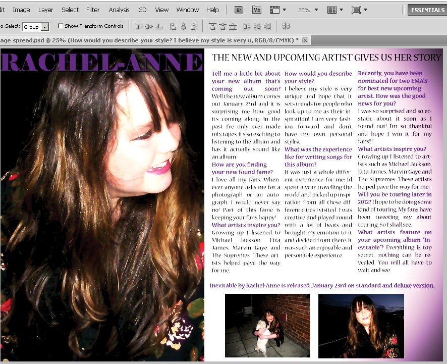
This is my second attempt of producing a double page spread. The one i made first time round did not look professional enough. I decided to go ahead and change add a few more things to my double page spread. Firstly i adjusted the picture and added another 2 pictures to the bottom of the right hand side of the page to show i have more than just 2 type of shots, by adding 2 pictures the audience can then see more looks from the their favourite artist. Also i decided to move the mast head to the left of the page to make the article more appealing and stylish. Overall i think the second attempt of the double page spread is so much better than the first.

Evaluation AS

Thursday 1 December 2011

Double Page Spread


This is my double page spread. For the background i used a gradient along the right hand side of the page, it makes the page look stylish as i used a purple tone to go with the house style of the magazine. Purple is shown throughout the magazine and ensures the house style runs throughout the magazine. Keeping the colours to purple and black keeps the magazine consistent. On the right on the second print screening, this shows all the different layers of the image, background and text. For the layout of the interview i have used column form, this is how magazine set out interviews therefore i have used the same layout and keeping to the style of any other magazine. For each question, i have used the colour purple and made the text bold to make the questions stand out to the audience. The answers are in black below the questions. I edited the image by airbrushing and sharpening it, this made the image appear to look more sleek and professional. She appears to be smiling, this will gain audiences interest as she appears to be showing a soft side of her personality. "The new and upcoming artist" this makes the audience interested in the artice and makes them want to read more about her as the title seems to be saying the interview will give the audience on information they want to hear about their favourite artist.

Thursday 26 May 2011

Contents page

Here is my magazine contents page, I edited the image to make it appear more professional by increasing the vibrance and saturation. I also added a vector mask to make her lip seem more pigmented to stand out and reflect on the R&B style of bold make-up. I cropped the image to take away excess background that was unncessary and added a white box to be the contents background. At the beginning I had to enlarge the image and click alt at the same time to make sure the pixels didn't stretch the image. For the headline of 'CONTENTS' I made it white and added a stroke to come from the centre, this allowed the text to have its own individual house style. I kept with the house style colours of purple and black to make the magazine seem consistent. For the page numbers,  I made them purple in britannic bold and added a stroke from the outside in black to make them stand out. I added subheadings and small explanations to show the reader what is on each page and hopefully persuade the reader to look at the stories. I used buzz words like 'EXCLUSIVE' and 'LATEST' to make the stories seem extravagent.

Front cover

Original picture


I adjusted the vibrance, airbrushed the client, sharpened the client and used the liquify tool to make her face thinner. I then added a masthead and headlines and edited them by adding drop shadows and strokes. My target audience is for teenage girls, therefore the colour range of purple and white distinguishes the magazines house style, compared to other teenage magazines such as Smash hits. The purple and white theme makes the magazine look professional and persistant throughout.


Here is my final product, I added a banner at the bottom, a barcode, price tag and website, another headline and added a vector mask so the clients head will be in front of the text.